Logos are like the face of your brand. Whether it’s on a website, an app, or packaging, your logo needs to shine. But what happens when your beautiful logo ends up in a dark-themed app? Or a super bright one with vivid colors? That’s where testing logo variants becomes super important.
TL;DR:
Testing your logo across dark, light, and high-saturation UIs is crucial. It ensures your brand always looks great, no matter where it’s seen. Some visually amazing logos flop when colors clash with the background. So test, tweak, and test again!
Why You Can’t Trust Just One Logo
We all love a great-looking logo. But not all backgrounds love your logo back. A logo designed for a white background can vanish on a black screen. A colorful backdrop might overwhelm a delicate logo.
Your logo needs flexibility. It should adapt like a chameleon, but with style.
Three Main UI Themes You Must Consider
- Dark Mode: Think blacks, grays, and moody tones.
- Light Mode: Classic bright white with soft tints.
- High-Saturation Mode: Bold colors – think neon buttons, vibrant backgrounds, and loud gradients.
Why Theme Matters
Dark, light, and high-sat UIs change the way people see your design. It’s not about taste — it’s about visibility and balance. Your logo should feel right at home wherever it lands.
Let’s break it down to see what works on each UI theme. We’ll also explore what might go wrong and how to fix it.
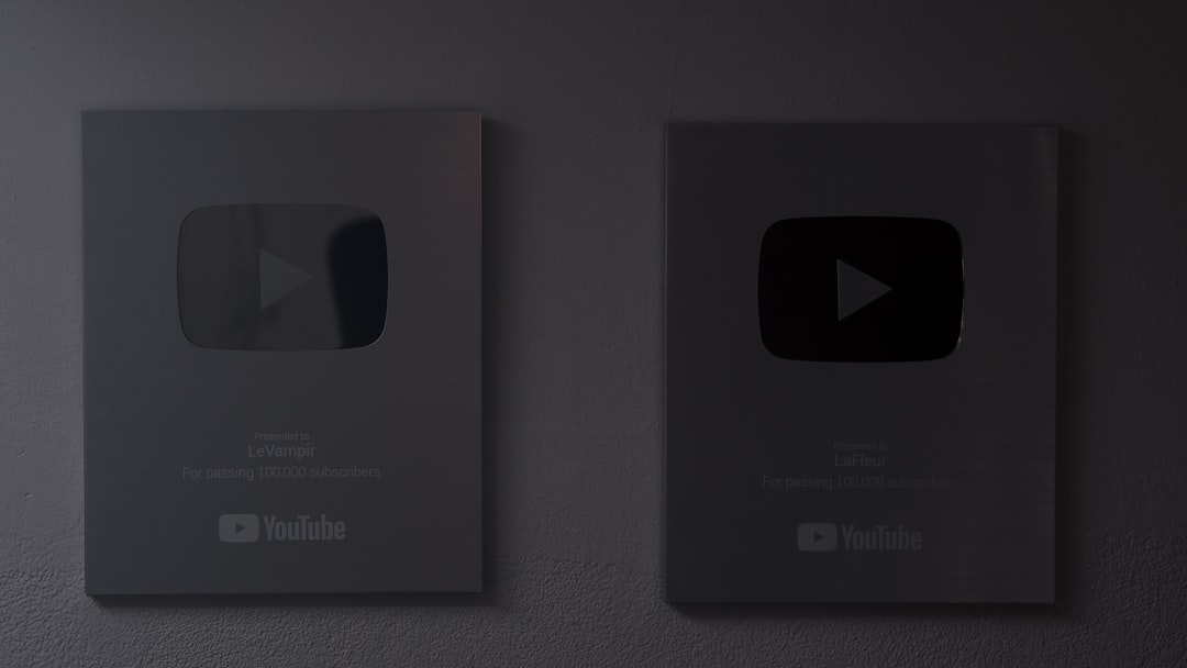
1. Testing for Dark Mode
Dark mode is ultra-trendy. It’s kinder on the eyes, saves battery life, and just looks cool. But it can swallow a dark-colored logo whole.
Here’s how to make sure your logo survives:
- Use lighter versions: A white or light grey version of your logo works better.
- Add glow or outlines: These can help subtle parts stand out.
- Test on different screen types: Dark mode can vary a lot across devices.
Bonus tip: Make sure shadows in your logo don’t disappear into the background!
2. Testing for Light UI
This is the most traditional and often safest style. White backgrounds give a clean slate. But they can make light or outline-only logos hard to see.
Design tricks to try:
- Use bold contrasts: A bolder version of your logo might be needed.
- Avoid thin lines: They might vanish in bright light or glare.
- Watch out for gradients: Subtle gradient logos can fade into the background.
Light UI might seem easy, but it still plays tricks with contrast. Be sharp!
3. Testing for High-Saturation UI
This one’s the wild card. Think music apps, games, or digital art spaces. The colors are loud. Punchy. Even a great logo can look out of place.
Survival tips for busy backgrounds:
- Use logo containers: Like a badge or shape around your logo.
- Try monochrome or single-color versions: Lessen color chaos.
- Make use of drop shadows or strokes: They help your logo pop.
You want your logo to scream “I belong here!” — not “Help, I’m lost!”.
How to Actually Test Variants
OK, so you know why variants matter. But how do you go about testing them?
Here’s a simple path:
- Create three logo versions: Light, dark, and neutral.
- Apply them to mockups: Put them on screenshots of real UIs.
- Judge visibility and vibe: Do they feel balanced and easy to see?
Test with:
- Users (ask friends or coworkers)
- Different devices (phones, tablets, monitors)
- Different lighting conditions (indoor, outdoor)
Designers call this visual context testing. It’s fancy-sounding, but it’s really just smart experimenting.
Don’t Forget Accessibility
Your logo should not just look cool. It should be accessible.
Here’s what to check:
- Color contrast: Can people with vision challenges still see it clearly?
- Size and simplicity: Is the text or icon readable at small sizes?
- Color-blind friendliness: Does it rely on tricky color combos to work?
Think of your logo like a good friend: it should be easy to spot, even in a crowd.
Let the Logo Breathe
Color isn’t everything. Don’t crowd your logo. Give it visual breathing room, no matter the UI theme. A busy background AND a cramped logo is just no good.
Add padding, spacing, or even a semi-transparent box behind it. Little touches help it shine.
When in Doubt, Use Smart Automation
Some design tools now use AI to auto-select the best logo for the background. That’s great – as long as you’ve provided all the right variants! Make sure your dark, light, and high-sat versions exist so AI can do its job.

Final Checklist: Logo Variant Testing
Before wrapping up, run your logo through this quick test:
- ✔️ Works on dark backgrounds
- ✔️ Stands out on white backgrounds
- ✔️ Survives colorful chaos
- ✔️ Passes contrast and color-blind tests
- ✔️ Looks good on small screens, too
Wrapping It Up
Your logo is more than a file on your drive. It’s a living part of your brand. As users jump between night mode, bright daylight, and loud apps – your logo must keep up.
So test often, iterate each version, and give your logo the style wardrobe it deserves!
Your brand is worth it.